There’s probably no more iconic or longer lasting image in science fiction than the British police box. It’s incongruity in itself is inspired brilliance. Doctor Who is one of the very few shows that hasn’t been cloned for the American television audience (thank goodness), and one of the reasons is the exterior design of the TARDIS. It’s so British. Us Yanks would certainly need a viable American alternative for the audiences to “get” the gag and there’s no easy choice. The point is moot though as proper Doctor Who has established itself well enough across the globe. The unique icon stands.
The crazy thing is, Doctor Who has kept the image of the police box alive, decades after actual police boxes have all but disappeared. By the end of Tom Baker’s run in 1981, they were almost extinct. Time moves on and eventually, you had a better chance of seeing a police box in the time vortex (although you’re in for a treat if you pop to Glasgow).
There is something about the overall design that’s… I don’t know, comforting? Maybe it’s the reassuring promise of help. That becomes a key way in Bill Potts’ understanding of the Doctor in Smile (2017), in fact. In any case, this is about the police box and its own incarnations throughout the show’s history. Although I won’t be focusing on the minutia, we’ll take a look at the broad strokes as the many production teams have hauled the old girl across our world and the universe.
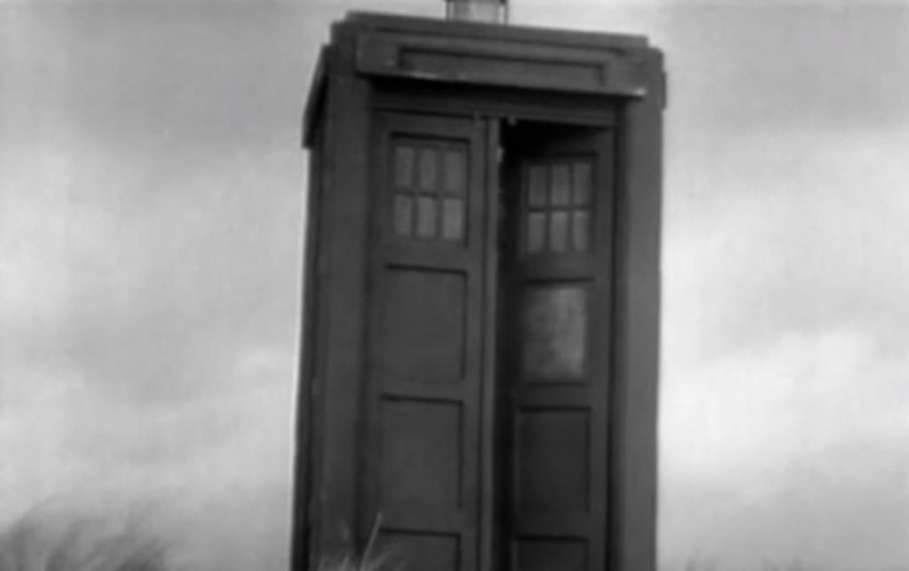
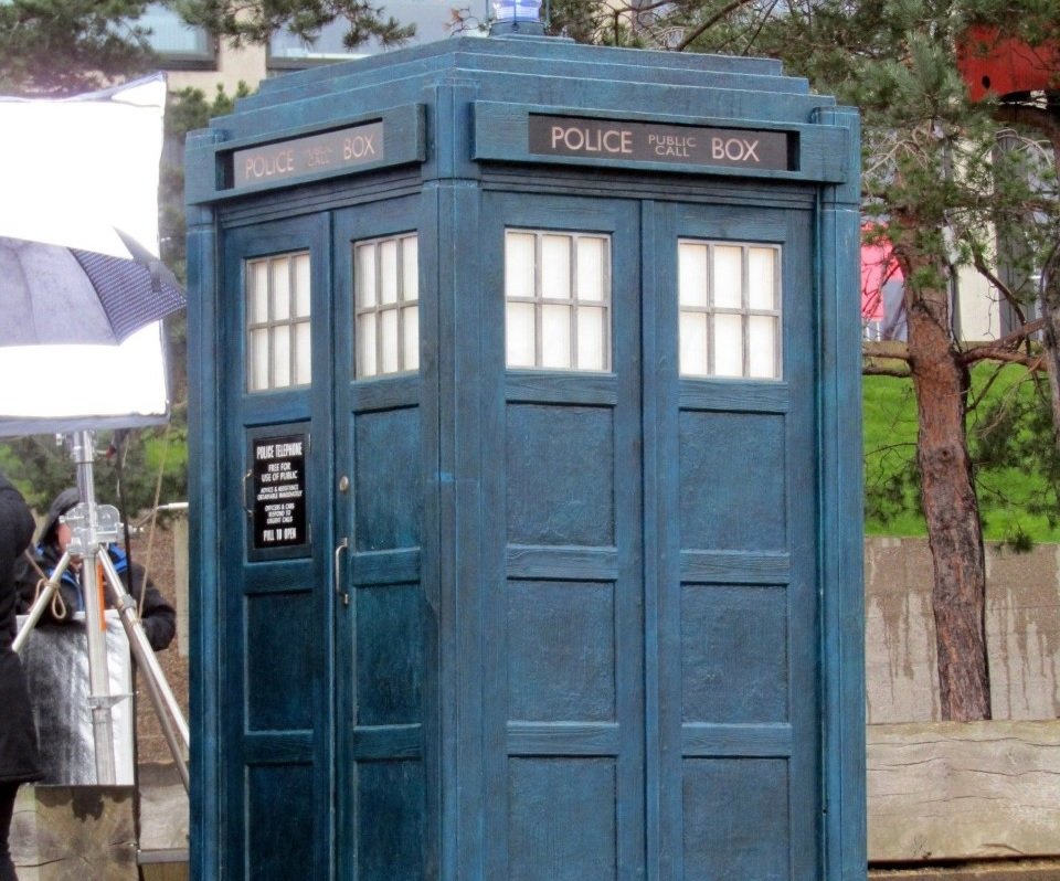
Version 1: The Original by Peter Brachacki

Peter Brachacki can claim this as his “design”, but they wanted a police box and there you go. It started out battered, with the St. John’s Ambulance symbol on the right door. Now, I have always loved the battered exterior. The more battered, the better. That a dilapidated shell such as this could contain such a fantastic, futuristic other dimension is deliciously delightful. The black and white episodes just helped make the poor old thing look that much more battered.
Over the next 13 years, between location shots, dismantling, and reassembling, the TARDIS’ outer shell just became more and more battered over time. All the better.
Version 2: Season 4, based on Peter Brachacki’s Original
The second version debuted in Season 4, but you’d probably not realise it because it was based so heavily on the Brachacki original.
The show was in black and white and with the prop getting dragged through a different quarry each week, all they really had to do was make sure it didn’t fall apart – that’s why it was rebuilt. The production team wanted a studier model, knowing that more on-location filming was due in the Second Doctor era They made small adjustments to parts of the roof (lowering it in 1966), lost the St. John symbol early on in Troughton’s tenure, and kept going. There was a short stint, mostly between The Evil of the Daleks and The Wheel in Space (except for model shots), where the “Pull to Open” sign got put on the right side instead of the left. I remember watching a Jon Pertwee story and the poor old thing didn’t even have the “Police (Public Call) Box” sign up top. It didn’t matter. The old girl was just having a bad hair day. Eventually, this prop pretty much disintegrated from overuse.
It’s kind of impressive that the original exterior design lasted about as long as the original interior, from the very start with William Hartnell, all the way into the Tom Baker years.
Version 3: Season 14 by Barry Newbery
This prop was a bit smaller and had a flat top (even more so than Version 1 at the end) which, for some reason, has become the most endearing version to me. The flat top tended to give the Newbery design a type of “shack” appearance, which further served that battered look, so I enjoyed it. Whenever the whole thing shook with a door slam, mission accomplished! Folks would always carp about wobbly sets back in the day, but a wobbly, broken-down TARDIS exterior just enhanced its reputation in my book.
Through the years of this prop’s use, once again bits and pieces were adjusted and tweaked. The most curious of all changes over the years with all the versions was the changing of various words, phrases, and letters within the assistance sign. Someone must always have been micro managing and just couldn’t stop.
Version 4: Season 18 by Tom Yardley-Jones

Incoming producer, John Nathan Turner ordered a new, fiberglass shell to go along with Tom Baker’s new threads in The Leisure Hive, which was used throughout the rest of the original series (although it did have some repaints along the way, so it was a bit more grey at one point). As always, lots of tiny tweaks here and there that most viewers wouldn’t really notice.
It’s impressive that there were really only three base props used during the 26 year run. I suppose it makes sense, as there were really only three base console rooms during the time, again, with cosmetic modifications throughout.
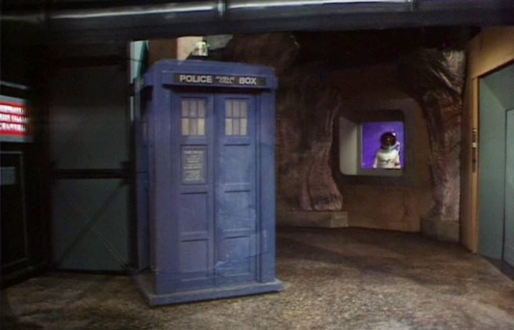
Version 5: The 1996 Movie by Hudolin

This was an attractive model with a more potent blue. A bit less battered to be sure and I’d imagine far sturdier than past versions, considering it was only used once and probably enjoyed an increased budget during construction.
Nonetheless, it was based on the Season 18 TARDIS.
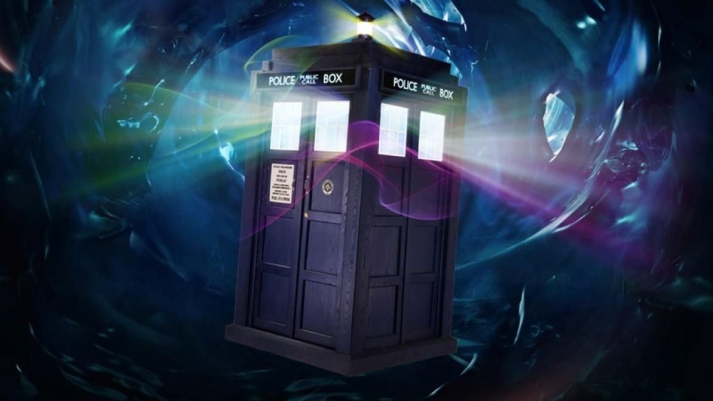
Version 6: 2005- 10 by Colin Richmond

An all-new shell was created for the show’s return, larger than before, and alternates were made for various reasons. This model stretched throughout the Russell T Davies era and for the first time, featured lights behind the windows and “Police Box” top sign to give the impression that there was an immense presence within. I always found that a bit odd. After all, the classic series console room was usually white and bright, but ever since the return, it’s been lit like a basement, a den, or a study. There’s no way it’d produce that much light for the windows. It also seemed rather obvious that there were lights attached to the windows, but small niggles there. The exterior itself looked appropriate and mostly, we were just happy to see any TARDIS back again!
Davies also made sure it used an ordinary Yale lock, thinking that kids could grab any old key and think it would give them access to all time and space. Neat idea!
The War Doctor’s TARDIS used this design as its basis, though obviously looked tattier, and smeared in sand.
Version 7: Series 5 by Matt Savage and Edward Thomas
This model was maybe the most brilliant blue ever – with a pay-off in The Big Bang (2010) – and had crisp, white-framed windows, along with the return of the St. John’s symbol. It was clean, fresh, and sparkly new. It was vibrant. This one presented a problem for me. I like things clean and sparkly. But I like my TARDIS to be beaten up and ramshackle in appearance. As much as I loved the Steven Moffat era and even loved the TARDIS interior decor introduced along with Matt Smith, this TARDIS looked like a big, plastic toy. It looked too perfect.
Moffat was a big fan of the 1960s Peter Cushing movies and it was an influence on a few things – the TARDIS exterior for one and the multi-colour iMac Daleks for another. No one’s perfect. It was also by no means a deal breaker anymore than any other version. Nothing wrong with variety.
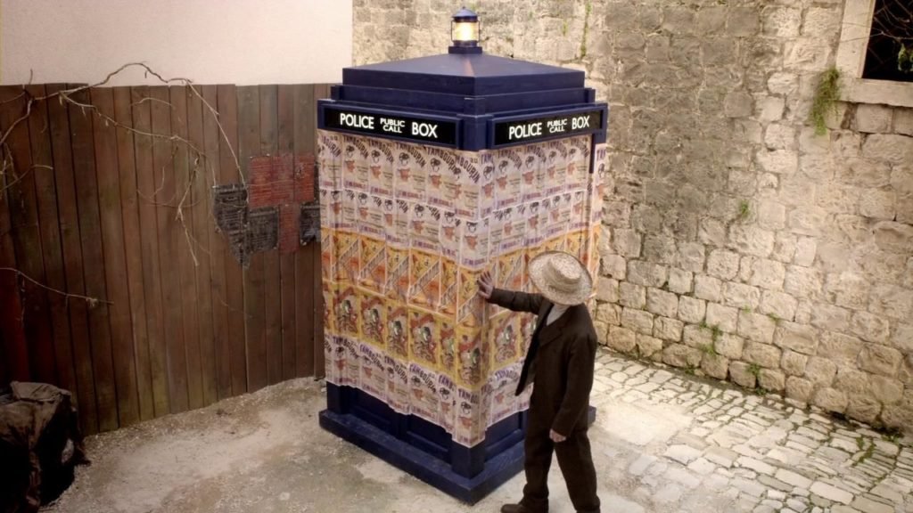
This exterior went through the mill a bit: it was covered in posters in Vincent and the Doctor, miniaturised in Flatline, and, also in the latter Peter Capaldi serial, replaced briefly by a Siege Mode model.
Version 8: Series 11 by Arwel Wyn Jones
With all the controversy concerning the new direction of the show, the even bigger controversy regarding the quality of some of the episodes, and even the controversy about the new TARDIS console room… no one noticed that Jones actually did a decent job on the new exterior!
It’s gone back to that battered look, a bit darker, with a lovely and elegant lamp on top. I think it’s quite nice and it might be the thing I like best about Series 11.
And you, dear readers, any particular favourites?