Our local paper ran a story last week. It said that South Oxfordshire has been earmarked as a destination of choice for future mineral extraction sites. In other words, they’re going to dig more quarries. It’s bound to prompt a flurry of protests, Facebook groups, and angry signs taped to lamp posts in the quiet little villages that surround the town where I live, as the locals complain that they’re more than happy for quarries to be built, as long as it’s somewhere else. “On the other hand,” I said, as we discussed it round the dinner table, “think of how many Doctor Who episodes they could film.”
It’s a running joke, really, having a pop at the visual style. It was shot on the cheap, and in many respects it showed, particularly if you were outside. Why fly the team out to Tibet when Snowdonia will do just as well? (The answer is that it didn’t, not really, but air travel was expensive.) If you wanted an alien landscape, you film it in a chalk pit and stick a bit of sepia on it. Who cares, as long as the story works?

But then something happened in the long dark between 1989 and 2005, and when Doctor Who came back, things were different. It suddenly looked reasonably good. The CG was never less than passable (with the possible exception of The Lazarus Experiment), and sometimes really quite effective. The alien landscapes actually looked a bit alien. What was more, some of the cinematography was breathtaking: shots that could teach a lesson or two to even some of our finest auteurs. That’s before we get to the lighting. Everyone remembers the writers and directors and actors. Why can no one name the cinematographers?
It’s something we need to fix. And we’re starting, over at this quiet little corner of the internet, by picking out some of our very favourite shots from over the years. There are no rules for inclusion: we might feel that a visual encapsulates a theme or a character in an episode; perhaps it affected us emotionally; or perhaps we’re struck by a particularly innovative technique. Or perhaps it’s there simply because it looks pretty. There are lines of dialogue that stick in your memory; it turns out it’s the same with visual images. I mentioned the chasm between classic and modern, but you may be surprised at just how many of these are from the Classic era, simply because they’ve stuck with the people writing about them. It’s also testament to the fact that – for all my mockery about quarries and Welsh landscapes – there really was some stunning work in Old Who, often in the most adverse of conditions, and we’d do well to remember that for a largely studio-bound production on a tight budget, Doctor Who was sometimes capable of great things.
I’ll stop talking now, and hand you over to the DWC team, who have quite a lot to say…
Tony Jones: Blink

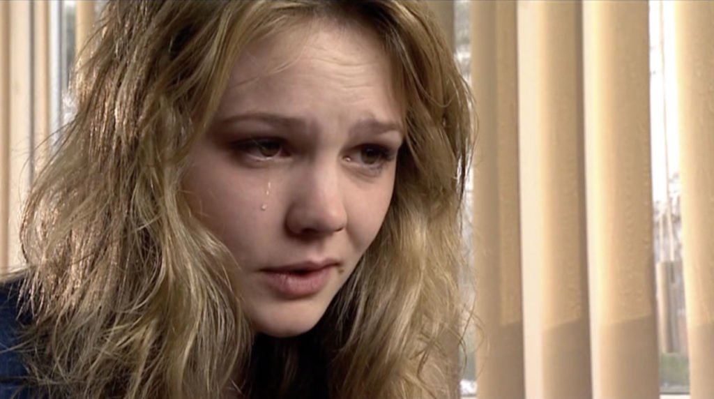
There’s a point during Blink when I realised it wasn’t just a good episode, it was a classic. When Sally is in the hospital watching Billy die, the same Billy who a short time ago in her timeline she was flirting with. Here she realises it’s not just something weird happening, but much more than that. The episode is very much framed by a simple prop, the use of rain. The opening scene has Sally climb over a rust gate in the rain, the rain links her time with young and old Billy, and the moments up to this image are brilliantly lit with ripples of light playing across the room as they speak. As Billy dies, the rain stops and the story moves into a more serious gear. Until then Sally is in the moment that changes her life as tears roll down her cheek. Sublime!
Simon Danes: An Unearthly Child

I’m going to go with this. It’s from the very first episode, a couple of minutes before it ends.
It’s when the Doctor agrees to allow Susan to leave the Ship with the schoolteachers — and then double-crosses her, activates the controls… and the TARDIS takes off. We cut from the lurching of the Ship, the central column rising impossibly high, the lights on the console blazing and flaring the picture — to this.
The TARDIS is not a comfortable or homely place in An Unearthly Child. It’s bewildering, sinister, and frightening — much like its owner, the mysterious and unpleasant old man whom the credits call Dr Who and who is never addressed as anything other than “Grandfather” in Part One. Everything the old man told the teachers about his Ship turns out to be true — as we find out with this simple yet hugely effective picture caption: London appears on the screen, the camera tracks out, and then the picture fades to black. The familiar fades into nothingness. Ian and Barbara, in Dr Who’s extraordinary machine, are ripped out of reality, cut off utterly from their home city and home world, and there’s nothing they can do about it.
“Silly, isn’t it?” said Barbara earlier in the episode. “I feel frightened. It’s as if we’re about to interfere in something that’s best left alone.” She was right.
Philip Bates: A Christmas Carol

Toby Haynes is the only director to have helmed five consecutive episodes of Doctor Who (2005- present), and he’s one of the best. The Pandorica Opens/ The Big Bang, A Christmas Carol, The Impossible Astronaut/ Day of the Moon: they’re all a visual treat. It’s naturally tough picking one shot among my favourite run of Doctor Who, let alone Doctor Who in its entirety, but with the festive season underway, A Christmas Carol quickly popped into mind.
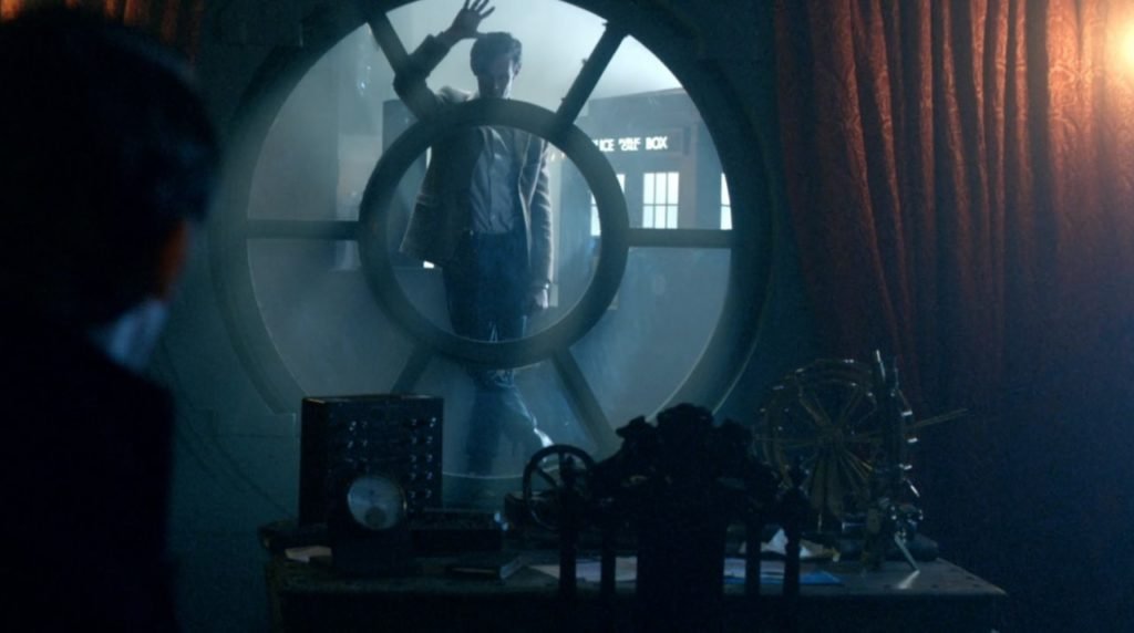
This shot, Kazran Sardick’s rejection of the Doctor after learning that Abigail is dying (and they’ve been using up her time), has always struck me as hauntingly beautiful.
Haynes’ talent is in capturing the tone of a piece throughout – helped along, of course, by brilliant design and set dressing. The 2010 Christmas special was the first designed by Michael Pickwoad (a lovely and very talented man) and he captures the spirit of the festivities wonderfully. That’s how the Doctor appears here: a spirit – indeed, the Ghost of Christmas Past, Present, and Future. He’s the opportunity that Kazran decides to shut out, the redemption that he seemingly pushes away, informed by the past. The ethereal feeling makes Matt Smith a spectre; the bright, almost two-tone, light in contrast to Kazran’s gloomy rooms. Here he is, halfway out of the dark, and refusing to go any further for fear of loss.
There’s also the clear parallel with previous festive visits – the Doctor visiting the young Kazran for the first time and forcing his way into his life through that same window; and the second as a crying Abigail watches her family celebrating Christmas through a window and worrying that she’ll never be a part of this. The Doctor gave a wave then, welcoming her in; he does the same here, sure that Kazran’s changed his mind over the past 12 months. Mourning (and that’s what this is – albeit ahead of Abigail’s time) doesn’t fade though.
A Christmas Carol is a festive feast for the eyes, but this particular shot took my breath away when it initially aired. I’ve long admired the work of directors on TV – unlike movies, they’re the ones whose work often goes unappreciated. But look at what they can achieve. Gorgeous. Just gorgeous.
Rick Lundeen: Mawdryn Undead

One of the most iconic and powerful visuals for me was during the Brigadier’s flashback in Mawdryn Undead. As the Brig is mentally transported back, we fade back to stark black and white. Immediately, we see a close up of two Yeti standing in the London Underground, one holding a smoking weapon, from Web of Fear. If ever there was a classic story of Doctor Who that thrived on the brilliance of black and white, it was Web. Mind you, at the time, this was the early ’80s in the states and I hadn’t seen much Troughton at that point and never before seen the Yeti in action, so it was that much more of stunning visual surprise. Still a favourite visual to this day and the recovery of most of Web was a real treat.
Joe Siegler: The Ghost Monument

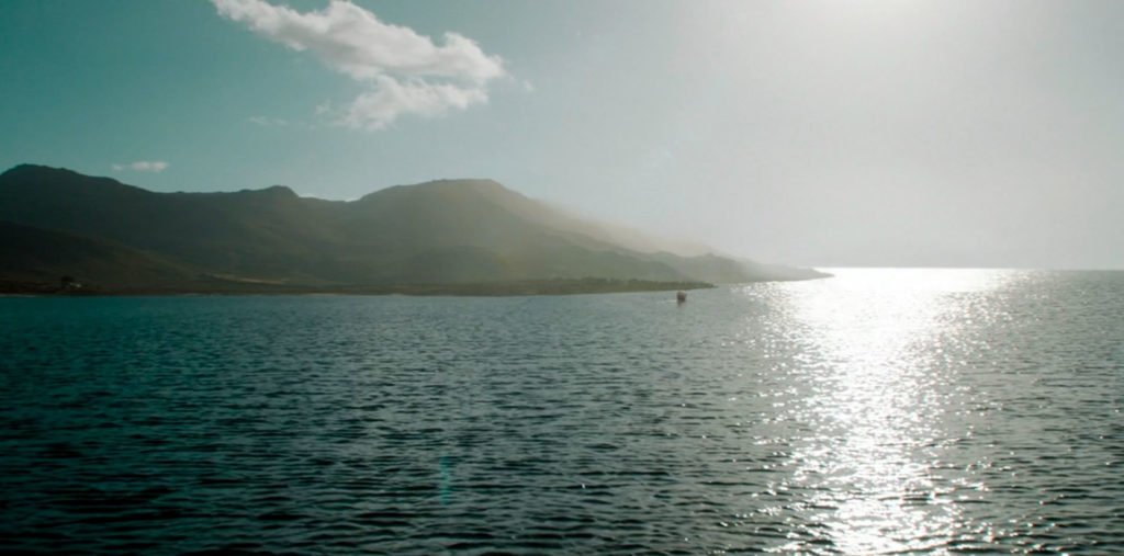
This shot from Series 11’s The Ghost Monument. The episode was kind of meh, as was the series in general. However, this series looked significantlybetter than most, and this shot in particular is memorable for me as I never thought Doctor Who would ever visually look this good.
Bar Nash-Williams: The War Games

The BBC may have been tasked to educate, inform, and entertain, but Doctor Who always added ‘and help people see things from a different point of view.’ Often it is the point of view of the underdog, the oppressed, the Other: the unsubtle morality tale of Galaxy 4 – the big scary ugly green monsters are the nice guys and the blonde bombshells are out for your scalp – was no surprise to those who’d got used to Who and seeing things from a different angle. But The War Games takes it to a whole new level.
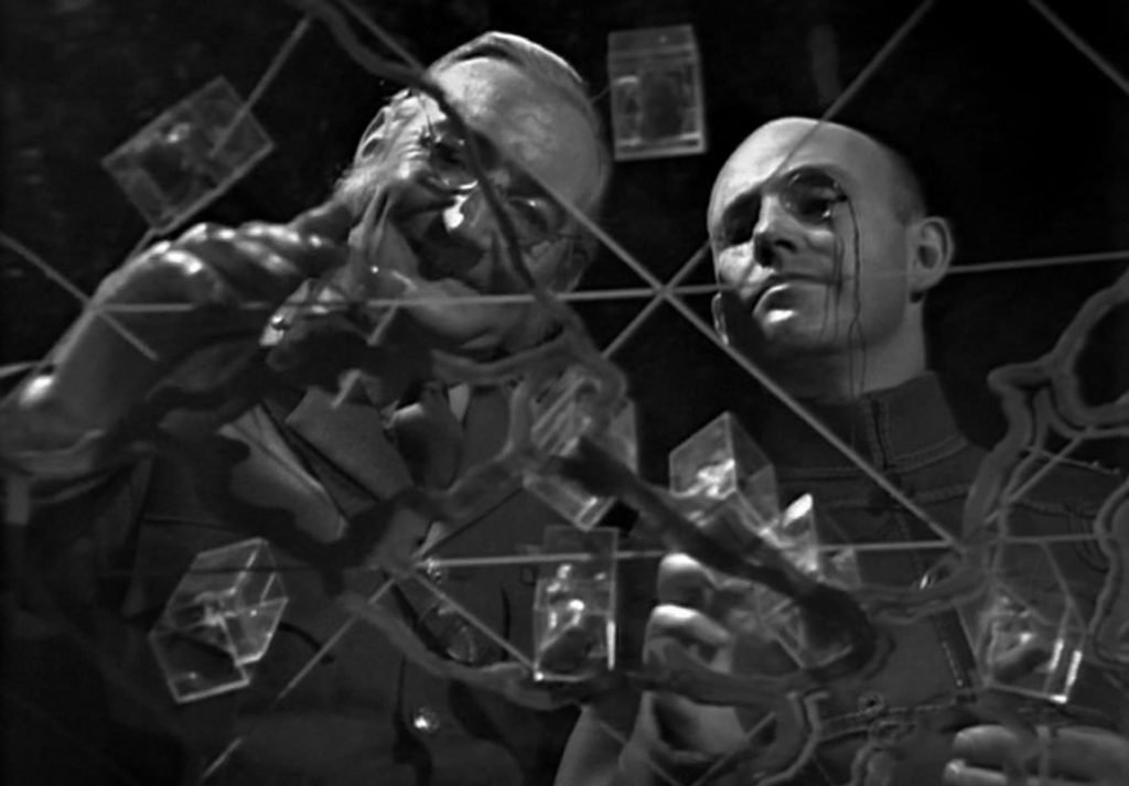
The whole story is about what people can and can’t see depending on their point of view, and it’s never quite as simple as it looks. In this shot we see – from underneath – the ones who are supposedly in charge, who quite literally here have an overview of the situation. But they all have impaired vision. The control centre scientists wear those strange eye-shields, their audience all blinkered by them. The War Lord’s superlative softly-whispered menace comes with glasses so thick Madoc could hardly see where he was going. Smythe has Himmler specs, Von Weich has a monocle, and the security chief’s device for seeing the truth encases his whole head. And doesn’t work. Only the War Chief has clearer vision – like the Doctor, he is a privileged outsider, with the knowledge of time and space hidden from the others.
Which brings me to the Doctor and companions. At first, they can’t see what’s going on, but soon pass through the mists that inhibit the other captives, and remaining un-hypnotised, piece together the bigger picture. They help to lift the veil from more rebels, who have also seen the truth that they have far more in common with each other than things that divide them. Except for the sombreros. I could make a political point about what happens when the victims realise that rank and privilege has been setting them against each other when their real enemy was the ones controlling the status quo, but that might be a somewhat controversial point of view.
What is really clever about this shot, however, isn’t just that it – like David Fincher’s Fight Club – shows you how to watch the rest of the story, be aware of viewpoints and vision or lack thereof. It takes it one step further and tells you just whose viewpoint really has the power here; the one behind the lens. No, not the cameraman or the director (David Maloney, who else?), but yes, dear reader, you and me. The War Lord may have been in charge of the operation, but like all mercenaries and arms dealers, he had a client. Us. That glass table acts like a porous fourth wall, drawing our attention to the fact that we are looking through a camera. That alienation points back at us – the ones who, week by week, force our captive heroes through the mists of the time vortex from one zone to another; ancient Atlantis, future Skaro, swinging Sixties London, Moonbase beta. It’s us who demand the team is threatened by mad scientists or monsters, foam machines, or Kevin Stoney’s eyebrow.
Then, just when we think we’ve got the point, Uncle Terry blindsides us with something no one saw coming. Writer and director reassert their control as much as that of the Time Lords through slo-mo and freeze frame, and the show will never be the same again. I love The War Games, I love Doctor Who; it helped teach me to see things differently.
James Baldock: The Name of the Doctor

“At first,” said Bar, when I initially sent out this request, “I thought you were joking. One shot from 56 years of programme?”
I sympathise. It really is a difficult task, picking out a single image from the goldmine of treasures on offer. The selection process is no less arduous than trying to choose a favourite story, or even a favourite Doctor: why Pertwee over Troughton? Why Capaldi over Tennant? (Actually, that one’s easy; we’ll skip that.)
Choosing a single image is tough: I imagine it was tough for all of us. But if I had to pick one – just one – then I might pick this. It’s not perhaps the most obvious choice; it’s not particularly pretty or artfully composed; it doesn’t showcase beautiful scenery or an amazing make-up job. But it is a game-changer. As Jenna Coleman stumbles around a smoky, cracked wasteland – Mordor, by way of Port Talbot – she is finally saved by the man she helped to save, but she’s also about to discover a terrible secret.
There were two ways of viewing this episode: either you didn’t know what’s coming, and your mind was blown, or you did, and it was like seeing the Hulk come out after an hour of introspection from Bruce Banner. It helps that we know that this is the Doctor’s head, and by extension that this isn’t simply a random character. It also helps that (director) Saul Metzstein keeps it simple: the Doctor tearfully embraces a traumatised Clara, before his eyes widen in fear at something – or, rather, someone – just off camera. We see the War Doctor from behind, from the waist up, practically in silhouette, surveying the ruins of what would turn out to be Arcadia, shoulders very slightly hunched. Is he looking downwards, perhaps in shame? No, it’s remorse, tempered with a healthy slice of self-justification.
But all this is experienced very much from the Doctor’s point of view: you can see, just at the right, how Clara’s form distorts his vision, and indeed much of the episode is like this, flitting between tight close-ups and thoughtful long shots, as if the characters were being observed by someone other than the viewer. This is the Doctor’s story – a story that is about to become full circle – and the War Doctor is at the heart of it. From his very first appearance, he is defined chiefly by how others see him – perhaps more so than any other incarnation, before or since.
2013 would see several surprise appearances: that the show didn’t succumb to gimmick fatigue is largely down to execution. Baker’s cameo, for example, began with his iconic, unmistakable voice, booming from the sidelines; McGann is announced with a similar flurry, which makes perfect sense given that for years we’ve come to know him primarily through his vocal inflections. Hurt is just there, standing silently, chastened and mute, like a rebellious schoolboy banished to the naughty corner, at least until Smith has finished telling him off. While much of the impact is lost when stripped of context, it’s still the closest we’ve come to entirely redefining the history of Doctor Who in a single shot. In 56 years of programming, that’s not a bad achievement.
Dearest reader: we’re reasonably confident that, while we’ve been compiling lists of our own favourite shots, we probably haven’t mentioned any of yours. So it’s over to you. Be sure to let us know which ones have stuck in your head!