The Cybermen have one of the most distinctive, and awesome, designs in not just Doctor Who but all of television. And yet their core aspects are relatively few: everyone knows the handles and the teardrops, but even the former addition wasn’t added until 1968’s The Wheel in Space.
Nonetheless, from The Tenth Planet to The Doctor Falls, they’re an arresting image.
So which of these designs were best? Which suit suited? Which is most iconic?
Oh, who doesn’t like a list anyway…?
Please note, we’re not including Cyber-Controllers, -Kings, -Planners, -Leaders, -mats, -Shades, or –mites. It just wouldn’t be fair to prefer one type of Cybermat over a major Cyberman look.
Special Mention: Attack of the Cyberman

This is an interesting one, because you might not even know it exists.
It looks fantastic, but it doesn’t deserve a proper space in the ranking – merely a special mention, which is, y’know, special at least – because it doesn’t appear much at all.
You’ll find this Cyberman in Attack of the Cybermen (1985), a variant from the 1980s Cybermen as it’s entirely black. He’s often lurking in the background (and is one of those rare Cybermen who gets into the TARDIS), but you’ll also be squinting in the sewers to see if it’s this Cyber-design or just a normal one hidden in the dark underground.
Pfft, and they say Doctor Who needs more diversity.
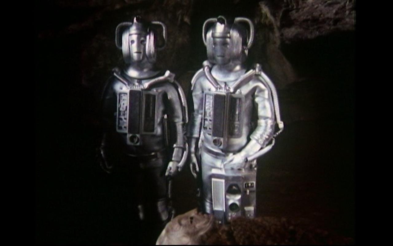
9. The Wheel in Space Cybermen

I’ll go out on a limb here and say that there are no rubbish Cybermen designs. Apart from this one. No, no, I’m kidding. All Cybermen look cool, and they all are instantly identifiable as Cybermen, which is pretty high on the list of Stuff Cybermen Designs Need To Be. I mean, look at the Nestene Consciousness in Rose (2005): it doesn’t resemble a squid strangling Jon Pertwee at all! (Mind you, that’s the first Nestene I saw, so I think it’s super.)
There are no bad Cybermen designs, but there are lazier ones. The Wheel in Space is a good example of this, which is a shame as there’s nothing particularly wrong with them.
The teardrop makes its debut – it’s for oil, okay? Not tears because Cybermen can’t feel! – but not as you know it. Sure, you’re used to seeing them by the eyes, but this Wheel special edition comes with an added drop in the middle of its mouth. Like it’s dribbling. Or a tedious jigsaw.
It is, regardless, a redesign; however, it’s largely confined to their head units, and comes across as distinctly underwhelming.
8. Revenge of the Cybermen
Revenge of the Cybermen (1975) has a bad reputation, yet the Cybermen are the best thing about it. Viewers let out a collective gasp to see the creatures again, the Cybermen not appearing alongside the Third Doctor at all. So when they returned for the Fourth Doctor, they were sure to please all.
Except they didn’t. Because there were three of them.
Still, it’s their unimaginative silver bodysuit that gets these versions so low in the rankings. They’re more streamlined than their Invasion (1968) counterparts which is nice, but they nonetheless feel like a step down. At least the stupid zip at the front has gone.
Plus, their heads make a wonderfully chilling and alien sound effect when they kill/maim someone. You’re making that noise now, aren’t you?
7. The Invasion Cybermen

Speaking of The Invasion, here they are, and honestly, they should’ve been lower in this list – except they’re so damn iconic!
Look at them marching down the steps outside St. Paul’s Cathedral. It’s enough to give you chills.
But they’re not the best design, not by a long shot.
Why? Well, we’ve already covered the zip. Normally, you can look past this sort of thing, but crikey, it’s prominent. They even have this bit where the zip extends too far, resulting in a dangly section at the front – which I presume is just to hit home that they’re Cybermen. As if that weren’t macho-macho-man, the crotch is neatly outlined in Sharpie. Add in the silver tights – those Cybermen have awfully knobbly knees – and these Cybermen are like throw-forwards to 1980s music videos.
Man, that wrecks the UNIT dating conundrum up even further.
6. 2013- Present Cybermen

Yowch. The latest design, introduced in 2013’s Nightmare in Silver, isn’t a bad look in the slightest, but it still finds itself pretty low. These are Cybermen for slim people. They’re not messing about: they don’t care if you’re a body-builder or have a fully-stamped loyalty card for McDonalds: the Cybermen will chop off your muscles, your fat, your unnecessary excesses, and shove you inside a slimline silver suit. Before you all queue up for upgrades, remember that a lack of emotion will stop any pride in a beach-ready body.
I actually really love this design, but it’s very divisive. Their movements are suh-weet, but they decided to add that stomping noise to them and it all just reinforces that they’re robots. Which they’re not.
Another major criticism is that they’re basically Doctor Who‘s version of Iron Man. In that all Cybermen struggle with alcoholism. Or perhaps just because Iron Man’s popular, and the BBC thought, “we’ll have some of that.” What’s more, in Death in Heaven (2014), Steven Moffat added repulsor units, probably because he famously writes while listening to WestLife albums, and was suitably inspired by Flying Without Wings.
I can’t believe I just made a WestLife gag.
5. Moonbase Cybermen

The first major redesign of the Cybermen came with their second appearance, The Moonbase (1967), and was used again in one of the most memorable and best-loved stories, Tomb of the Cybermen (1967).
It’s easy to make fun, and also to point out that, in retrospect, moving away from the flesh aspects of The Tenth Planet (1966) reduced their uncanny valley. But the silvery Cybermen were always going to be how the species ended up, and the amount of thought and detail put into them is truly wonderful.
Some may mock the use of ping-pong balls at joints, or their painted boots, and yet they still look great. A group wandering across the moon is a notably creepy image, as is them drifting off into space; turning to Tomb of the Cybermen, the obvious iconic moment is the Cybermen escaping from their tombs. There’s also that shock of the empty cyber-suit zooming into view at the cliffhanger of Part One, and their eerie assurances that we belong to them, we will become like them.
They will survive, and based on this imposing design, you believe it.
4. Mondasian Cybermen

Similarly, many will have scoffed at the clothed faces of the original Cybermen, but those naysayers have been well and truly silenced by their horrifying depictions in World Enough and Time/ The Doctor Falls (2017).
You don’t need the Series 10 finale to get creeped out by those Mondasians. It’s all there in The Tenth Planet: a level of body horror that you’re surprised they were allowed to get away with back in the 1960s. Behind that clothed housing, there’s a human being – chopped up, spliced up, jumbled around, and formed into some semblance of a humanoid. There’s that human hand, reaching over a new corpse, reinforcing a chilling revelation: “Our brains are just like yours, except that certain weaknesses have been removed… You call them emotions, do you not?” Crikey. That’s dark.
And because the Cybermen here are somehow relatable, their arguments seem both terrible and understandable.
It’s all topped off with their voices. Death by sing-song. Brrrr.
3. Cybus Cybermen

Stomp. Stomp. Stomp.
Debuting in 2006, these Cybermen began on a parallel world and spread, etching themselves onto our world.
Tasked with redesigning a legendary enemy, what would you do? It’s a massive task, if one that’s really exciting. The Art Department decided the new Cybermen would need to incorporate much-loved classic elements, while getting rid of niggles that wouldn’t work for a new generation – namely the sometimes-foam onesies.
They made them chunky, imposing, threatening; in other words, big. They made them genuinely intimidating, with a cold inhuman face, and metals panels covering its entirety. They also lined the suits with pipes, and a gooey substance behind a wide chest unit that wasn’t the weakness obvious to anyone looking at older models. There’s a level of thought and detail that goes to show the love put into our favourite show, even down to the “C” (for Cybus) logo stamped into their middles, and replaced for A Good Man Goes to War (2011) onwards.
Of course, Nick Briggs’ cybernetic voice adds to the effect, as does Ailsa Berk’s choreography, meaning the Cybermen have never looked so in-tune with one another.
A relentless army, and the go-to Cybermen for a new generation.
2. The Flood Cybermen

For many, mention The Flood, and they’ll think of the watery bad guys in The Waters of Mars (2009). For others, their minds will turn to the pivotal Doctor Who Magazine strip that saw the Eighth Doctor very nearly regenerate.
This was the pièce de résistance in the Eighth Doctor’s comic adventures, written by Scott Gray with art by Martin Geraghty. The Doctor and his companion, Destrii land amid rainfall – a rain that alters emotions. You can probably guess the antagonist from that information alone, but if not, I’ll just remind you that this is all about the Cybermen. Yeah? Yeah, you got it.
The Cybermen! And they are gorgeous.
They’re super-slimline and certainly couldn’t be realised on television without CGI or some considerable inhuman cruelty to actors.
Geraghty actually gives them a big redesign, but it just works so perfectly because they combine the classic Cybermen elements, given lovely twists. The handles are sharper, the teardrops aren’t defined but the eyes recall the dead quality of those Moonbase Cybermen, and they’re huge.
Their fingers end in sharp claws, a fine example of the way this design feels reminiscent of other versions; yet they’re also very much informed by the story.
If you’ve not read The Flood, it comes highly recommended (as does the entire Eighth Doctor’s comic strip era).
1. 1980s Cybermen

Coming up tops is the design you’ll have seen at conventions over several decades.
These first appeared in Earthshock (1982), delivering one of the Fifth Doctor’s finest cliffhangers. Part One finally brought back the deadly enemies after around seven years, and viewers were left to pick their jaws up off the floor. These Cybermen cropped up in just three further stories: The Five Doctors (1983), Attack of the Cybermen (1985), and Silver Nemesis (1988) – and in that latter tale, they were given a spit-polish. (They were shinier than ever in Silver Nemesis, but they’re the same design, so there’s no way there’s enough difference for that Seventh Doctor story to get its own place in the rankings.)
Still, their head and chest units are hugely memorable, as are, surprisingly, their guns, and their padded silver gloves (only complete losers make a fist and gleefully say “excellent” without padded silver gloves). But their jumpsuits were also brilliant: crinkled, with bits of mesh, and more detailed than they’re given credit for, they give the impression of some sort of nervous system hidden amid molten silver.
Plus, their mouths make them look grumpy, which is hilarious.
These were the last designs of Classic Doctor Who and so were technically the “current” look between 1982 and 2006, so you can’t deny that these are truly iconic.
Yeah, I know, you disagree with this list. But the whole point is to get people talking! So what’s your favourite and least favourite design…?